Area
Area chart.#
Usage#
This can get more complex by setting various other propertes within the cols property which will allow for the naming of columns and the ability to sort the data.
A more advanced version demonstrating this is displayed below.
Props#
| Prop | Description | Options / Example |
|---|---|---|
cols | Columns from Qlik Data Model to render in the chart. | array{[ "Case Owner Group", "=Avg([Case Duration Time])" ]} |
calcCondition | Calculated condition to be met before chart can be displayed. | shape{ qCond: "=Avg([Case Duration Time])> 5", qMsg: "Calculation condition has not been met", } |
suppressZero | Suppress items whith zero values from being displayed in the chart | boolean* default obtained from theme. |
barSortOrder | Order of the columns on which the returned data shoud be sorted | array[1,0] |
sortDirection | Direction by which the chart should be sorted. Can either be ascending or descending. | string'ASCENDING' 'ASC' 'DESCENDING' 'DESC' |
width | Chart width as a number which will be converted to pixels. If not set, the parent container width will be used | number |
height | Chart width as a number which will be converted to pixels. If not set, the parent container width will be used | number |
margin | The margin size around the component | string'5px' |
size | Size of the text used in the chart | oneOf'tiny' 'small' 'medium' 'large' 'xlarge' |
showLabels | Label position of values for the chart | oneOf'top' "none" 'inside' * default obtained from theme. |
border | Border to be dispalyed around the chart | booleanoneOf"top" "left" "bottom" "right" "start" "end" "horizontal" "vertical" "all" "between" "none" * default obtained from theme. |
backgroundColor | Background color the chart | string* default obtained from theme. |
backgroundStyle | Colour gradient of chart background. Pass style of one of below or pass styleFrom and styleTo | oneOf'Linear (to be used for custom gradient)' 'Radial (to be used for custom gradient)' 'DarkGreen' 'LightGreen' 'OrangeRed' 'PinkBlue' 'PinkRed' 'PurpleOrange' 'PurpleRed' 'PurpleTeal' 'SteelPurple' 'TealBlue' 'e.g' '{ style: "PinkBlue" }' '{ style: "Linear", styleFrom: "#fadadd", styleTo: "#89cff0" }' |
backgroundPattern | Background pattern for the chart | oneOf'Lines' 'Cirlces' 'Hexagon' 'Waves' |
fillStyle | Fill style for area. (Use qFillStyle in cols for individual area.) | oneOf'DarkGreen' 'LightGreen' 'OrangeRed' 'PinkBlue' 'PinkRed' 'PurpleOrangle' 'PurpleRed' 'PurpleTeal' 'SteelPurple' 'TealBlue' for custom pass object : { style : either Radial / Linear fillFrom : hexCode fillTo : hexCode} |
curveShape | Curve shape for area (use qCurve in cols for individual area. Currently applies to non stacked areas) | oneOf'Basis' 'BasisClose' 'BasisOpen' 'Step' 'StepAfter' 'StepBefore' 'Bundle' 'Linear' 'LinearClosed' 'MonotoneX' 'MonotoneY' 'Cardinal' 'CardinalClosed' 'CardinalOpen' 'CatmullRom' 'CatmullRomClosed' 'CatmullRomOpen' 'Natural' |
borderRadius | Border radius of the border around the chart | string* default obtained from theme. |
colorTheme | Color scheme to be used for the chart | arrayoneOf"motor" "divergent13" "divergent9" "eco" "bio" "red" "blue" "gray" "pink" "grape" "violet" "indigo" "blue" "cyan" "teal" "green" "lime" "yellow" "orange" * default obtained from theme. |
roundNum | Use round numbering to dispaly labels on charts | bool* default obtained from theme. |
precision | Number of decimal precsion when displaying bar labels | number |
title | Title to be dispalyed on top of chart | string* default obtained from theme. |
subTitle | Sub title to be dispalyed on top of chart | string* default obtained from theme. |
showLegend | Display chart legend. | booloneOf"right" "bottom" |
allowSelections | Allow selections to be made on the chart | bool* default obtained from theme. |
showAxisLabels | Display axis labels on the chart | booloneOf"both" "yAxis" "xAxis" "none" * default obtained from theme. |
hideAxisLine | Hide axis line on the chart | booloneOf"both" "yAxis" "xAxis" "none" * default obtained from theme. |
otherTotalSpec | Message to be displayed if an invalid measure is used in the cols property | boolshape{ qOtherLabel: "Other", qOtherCount: "5", } * default obtained from theme. |
gridArea | Name of the parent grid to place the Bar | string |
showBoxShadoow | Show or hide box shadow | boolean |
stacked | Stack the bar chart | boolean |
showAsPercent | Show the bars as percentage | boolean |
selectionMethod | Change the selection method, either click or brush | oneOf'click' 'brush' |
renderHorizontally | Render as a horizontal bar chart | boolean |
dualAxis | Add a second axis to the chart | boolean |
legendTopBottom | Render the legend on the top or bottom of the chart | string'top' 'bottom' |
legendLeftRight | Render the legend on the left or right of the chart | string'left' 'right' |
legendDirection | Direction of the legend values | string'row' 'column' |
numDimensionTicks | Number of ticks for the X Axis. Leave blank to auto calculate | number |
numMeasureTicks | Number of ticks for the Y Axis. Leave blank to auto calculate | number |
numMeasureDualTicks | Number of ticks for the second Y Axis. Leave blank to auto calculate | number |
formatAxisDate | Format of dates to be displayed on X Axis | string |
formatTooltipDate | Format of dates to be displayed on the tooltip | string |
showCrosshair | Turns the crosshair on or off. This appears alongside the tooltip when a bar is hovered over | |
crossHairStyles | Styling for the crosshair | object'e.g.' ' { fullHeight: false, fullWidth: false, lineStyles: { pointerEvents: "none", }, showCircle: true, showMultipleCircles: true, showHorizontalLine: true, showVerticalLine: true, stroke: "multi", strokeDasharray: "5,2", strokeWidth: 1, circleSize: 5, circleStyles: { pointerEvents: "none", }, circleFill: "white", circleClosestFill: "multi", circleStroke: "multi", circleClosestStroke: "multi", circleStrokeWidth: 1, highlightClosetsCircle: true, } ' | boolean |
showTooltip | Turns the tooltip on or off | boolean |
xAxisStyles | Set the X-Axis style, see the theme object for properties | object |
yAxisStyles | Set the Y-Axis style, see the theme object for properties | object |
xTickStyles | Set the X-Axis ticks style, see the theme object for properties | object |
yTickStyles | Set the Y-Axis ticks style, see the theme object for properties | object |
showBoxShadow | Show a shadow around the main chart container | boolean* default obtained from theme. |
Examples#
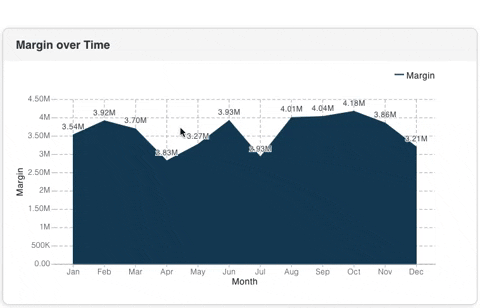
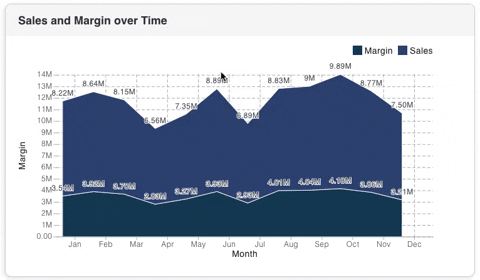
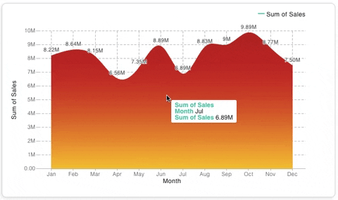
These examples are based off the Consumer Sales Qlik Sense application.
Stacked Area Chart#
Range Fill Color#
Theme API#
All components are styled from the main theme. Each theme can be overwtitten which will allow for all charts to share common functionality without having to set the props at an individual level.
Most of the chart settings are in global.chart. Changing any setting in the above will apply to all charts within the application. Specific bar chart related theme items are stored in bar. Changing these settings will apply to all bar charts within the application.
Theme settings can be overwritten at a global level, see below for an example.
global.chart#
The global.chart object is documented below.