Table
Table Component. Display data in a tabular format.#
Usage#
This can get more complex by setting various other propertes within the cols property which will allow for the naming of columns and the ability to sort the data.
A more advanced version demonstrating this is displayed below.
Props#
| Prop | Description | Options / Example |
|---|---|---|
columns | An array of objects to define the data to be used in the component. The columns need a dimension and / or measure object. See "Column Definition" below for the detailed object properties | array[{ dimensions : [ { qField: 'country', qLabel: 'Country', width: '10%', }, ], }, ] |
columnOrder | An array of integers (starting from 0), set the order of your table columns. Default order is as defined in the columns prop, with dimensions listed first and then measures. | array |
calcCondition | Calculated condition to be met before chart can be displayed. | object{ qCond: "=Avg([Case Duration Time])> 5", qMsg: "Calculation condition has not been met", } |
columnSortOrder | Order of the columns on which the returned dat shoud be sorted. | array[1,0] |
grandTotalsFlag | Set to true to show a grand totals row at the top of the table object. | bool |
margin | The amount of margin around the component | string'5px' |
height | Table height in percentage or value as pixels. | string'100%' '200px' |
wrapperWidth | Width of the outer wrapper around the table object. If this is smaller than the table width, a horizontal scrollbar will enable you to view all columns. | string'100%' '200px' |
tableWidth | Table width. | string'100%' '200px' |
size | Size of the text used in the table | oneOf'tiny' 'small' 'medium' 'large' 'xlarge' |
pageHeight | Number of records to be returned per page of the table. Note that increasing this will have a performance impact. | number30 |
tableLayout | Defines the algorithm used to lay out table cells, rows and columns. For more information regarding the impact, please see https://www.w3schools.com/cssref/pr_tab_table-layout.asp. | oneOf'fixed' 'auto' |
headerAlignment | Alignment of header row. | oneOf'left' 'center' 'right' 'leftRight' |
bodyAlignment | Alignment of header row. | oneOf'left' 'center' 'right' 'leftRight' |
headerBackgroundColor | Header background color. | string |
headerFontColor | Header font color. | string |
interactiveSort | Toggle interactive sorting icon in table header. | boolfalse |
grid | Add or remove the table grid. | boolfalse |
bandedRows | Add or remove banded row color. | boolfalse |
highlightOnSelection | Highlight cells on selection. If false, selected items will be bold | boolfalse |
allowSelections | To allow or disable selections. | booltrue |
Column Definition#
Below props are for use in the dimensions and measures array, within columns. An example of this can also be seen below.
| Props within columns | Description | Options / Example | dimensions or measures array? |
|---|---|---|---|
qField | Field name from your Qlik app | string'[Product Group Desc]' | both |
qLabel | Label of your dimension or measure | string'Product Group' | both |
qCondBackgroundFormat | Conditional background color | string'Product Group' | both |
qCondTextFormat | Conditional text color | string'Product Group' | both |
qSortCriteria | Sort criteria | Not available in beta release | Not available in beta release |
width | Column width, in pixels of a percent | string'10%' | both |
qNumType | Number type | oneOfU or UNKNOWN A or ASCII I or INTEGER R or REAL F or FIX M or MONEY D or DATE T or TIME TS or TIMESTAMP IV or INTERVAL | measure |
qNumFmt | Number format | string'#,##0' | measure |
Example#
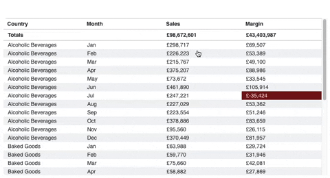
Simple Example#
Kitchen Sink Example#
Theme API#
table#
e.g. pie.main.otherTotalSpec = {{qOtherLabel: 'Other', qOtherCount: '5'}}
| Setting | Description | Options / Example |
|---|---|---|
color | table.color | |
selected | selected color | stringnull |
selectedFont | selected font color | string'white' |
headerBackground | header background color | string'white' |
bodyBackground | body background color | string'white' |
selectedBackground | selected background color | string'brand' |
oddRows | odd row color when the banded rows prop is set | string'white' |
evenRows | even row color when the banded rows prop is set | string'altGray1' |
hover | row hover color | string'#f2f2f2' |
wrapper | table.wrapper | |
borderColor | wrapper border color | string'altGray5' |
header | table.header | |
borderColor | header border color | string'altGray5' |
padding | header padding | string"0.4rem 0.7em" |
totals | table.totals | |
borderColor | totals border color | string'altGray5' |
padding | totals padding | string"0.4rem 0.7em" |
cells | table.cells | |
borderColor | cells border color | string'altGray5' |
padding | cells padding | string"0.2rem 0.7em" |