KPI
KPI. A component displaying data as a single numeric value.#
Usage#
This can get more complex by setting various other propertes within the cols property which will allow for the naming of columns and the ability to sort the data.
A more advanced version demonstrating this is displayed below.
Props#
| Prop | Description | Options / Example |
|---|---|---|
label | label to apear on the top of the KPI value | string |
cols | Columns from Qlik Data Model to render in the chart. | array{[ "=Avg([Case Duration Time])" ]} |
calcCondition | Calculated condition to be met before chart can be displayed. | shape{ qCond: "=Avg([Case Duration Time])> 5", qMsg: "Calculation condition has not been met", } |
width | Chart width in percentage or value as pixels | string'100%' '200px' |
margin | The amount of margin around the component | string'5px' |
size | Size of the text used in the chart | oneOf'tiny' 'small' 'medium' 'large' 'xlarge' |
color | Color of the KPI value | string* default obtained from theme. |
justifyContent | The alignment of the text within the component | oneOf"flex-start" "center" "flex-end" |
textAlign | Alignment of KPI label and Value relative to their container | oneOf"left" "center" "right" |
roundNum | Round vlaue and display large numbers with symbol e.g K for '000s | bool* default obtained from theme. |
precision | Precision if RoundNum set to true. True equals 2 deciamls places, false equals none | bool |
labelColor | Color of the KPI label | string |
alignSelf | Alignment of the KPI Label | oneOf"flex-start" "center" "flex-end" |
padding | Padding of the KPI | string |
maxWidth | Max width of the KPI, text will be wrapped | string |
border | Border to be dispalyed around the chart | booleanoneOf"top" "left" "bottom" "right" "start" "end" "horizontal" "vertical" "all" "between" "none" * default obtained from theme. |
backgroundColor | Background color the chart | string* default obtained from theme. |
responsive | Whether the KPI size should scale for tablet and mobile | bool |
onClick | Event function to execute when button is clicked | func |
cursor | Cursor style on hover | string |
autoSizeValue | Automatically resize the label if it is too large for the min wrapper | bool |
Sample Syntax#
config settings#
cols settings#
Overview
There are three different ways of specifying the columns:- As a string.
- As an Object
- As a reference to a predefined dimension or measure, a so-called master item.
If a string starts with =, it will be treated as a measure, otherwise it is treated as a dimension.
Use the object syntax if you want to set more options for your columns. If you. for example, create a pivot table with labels, you should use qFieldLabels for dimensions and qLabel for measures. Note the qLable is not used in this implementation of the KPI. The lable comes from the lable property
You can use dimensions and measures that are predefined in the app. This is mostly relevant if the user should be able to select dimensions and measures from lists. You must know the Dimension ID or the Measure ID, which is defined in the qLibraryID property. You must also state if it is a measure or a dimension in the qType property.
Examples#
These examples are based off the Consumer Sales Qlik Sense application.
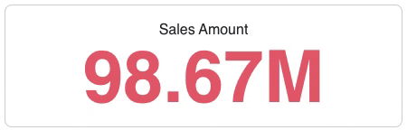
Standard KPI#
A standard KPI.
Theme API#
All components are styled from the main theme. Each theme can be overwtitten which will allow for all charts to share common functionality without having to set the props at an individual level.
Most of the chart settings are in global.chart. Changing any setting in the above will apply to all charts within the application. Specific KPI related theme items are stored in kpi. Changing these settings will apply to all KPIs within the application.
Theme settings can be overwritten at a global level. There are 2 possible approaches. Examples are shown below.
global.kpi#
Settings in global.chart relevant for KPIS are below :
| Setting | Description | Options / Example |
|---|---|---|
allowSelections | Allows to enable / disable selctions on charts at a global level. | bool |
backgroundColor | Apply a background color to all charts within the application. | string"white" |
borderRadius | Border radius for all charts. | string"10px" |
selection | global.chart.selection | |
opacity | Opacity of the item selected | number1 |
stroke | Stroke of the item selected | string"black" |
strokeWidth | Stroke width of the item selected | string"1px" |
nonSelection | global.chart.nonSelection | |
opacity | Opacity of the items not selected | number0.5 |
background | Background of the items not selected | string"var(--oc-gray-1)" |
label | global.chart.label | |
fontColor | Label color | string"fontAlt" |
noData | global.chart.noData | |
verticalAlign | Alignment of main object to display no data message | string"top" |
display | Display of main object to display no data message | string"inline-block" |
borderRadius | Border radius of main object to display no data message | string"10px" |
backgroundColor | Background color of main object to display no data message | string"var(--oc-gray-1)" |
borderCollapse | Border collapse of main object to display no data message | string"collapse" |
noDataContent | global.chart.noDataContent | |
display | Display attribute for the no data message | string"inline-block" |
alignItems | Alignment attribute for the no data message | string"center" |
justifyContent | Justify attribute for the no data message | string"center" |
margin | Margin attribute for the no data message | string"10px" |
error | global.chart.error | |
dimensionErrMsg | error mesage for invalid dimension | string"Invalid Dimension." |
measureErrMsg | error mesage for invalid measure | string"Invalid Measure. No values returned." |
kpi#
Settings in kpi are below :
e.g. kpi.wrapper.backgroundColor = "white"
| Setting | Description | Options / Example |
|---|---|---|
wrapper | kpi.wrapper | |
backgroundColor | Background color of the KPI | string"white" |
radius | Radius of the KPI border | string"8px" |
textAlign | Text alignment the KPI | string"center" |
boxSizing | CSS box sizing the KPI | string"border-box" |
label | kpi.label | |
fontColor | Font color the KPI label | string"font" |
alignSelf | CSS align self attribute of the KPI label | string"center" |
value | kpi.value | |
fontColor | Font color the KPI value | string"brand" |